1) Deadline was used around the time of the Civil War relating to prisons.
2) I will have to make it up as soon as I can.
3) I have not had any issues meeting deadlines in my classes.
4) No I do not find myself missing deadlines regularly.
5) All of my other assignments.
6) Complete it.
1) I think writing a to-do-list would be most helpful for me.
2) The most difficult would be to not get side-tracked because I get distracted really easy.
3) I am a night person.
4) It can get late when I need sleep and feel tired.
5) It would be hard for me to create a dedicated study time because I'm normally busy, or side-tracked.
6) My phone, people around me, and TV.
1) Organizing my material, having a study partner, and staying focused.
2) My ideal study setting is quite, comfy, and dim lights, with some background noise.
3) My biggest distractions are my phone and my TV.
4) Not have my phone near me and keep my TV off.
Wednesday, December 14, 2016
Monday, December 12, 2016
Monday, December 5, 2016
Top 100 Photos of All Time
1. I picked this image because it has some of the best oscar winning actors and actresses in it.
2. Ellen DeGeneres asked all these actors to join her in a selfie. Bradley Cooper was the on who took the photo. Ellen DeGeneres posted it on her twitter and it got 3 million retweets.
3. Bradley Cooper was trying to help DeGeneres and Street with their selfie but it ended up being a group selfie.
4.
Name: Ellen DeGeneres
Born: January 26, 1958
Born in LA
Atlanta High School

1. I picked this image because it is really simple and she is a natural beauty.
2. The photographer followed her around for blocks until she told him to leave. This photo shows her walking off.
3. The photographer was a little bit of a stalker and followed celebrities around. He was the first form of paparazzi.

Name: Ron Galella
Born: 1931
Born in New York City
Art Center College of Design

1. I picked this photo because it is a very iconic photo of Muhammad Ali winning his match against a champion.
2. Muhammad Ali was only 23 years old when he went up against Sonny Liston. People were saying that he would not win, but he proved them wrong.
3. It was a rematch with Ali and Liston. They fought again because people kept making excuses on why Ali won.

Name Neil Leifer
Born: 1943
New York City
2. Ellen DeGeneres asked all these actors to join her in a selfie. Bradley Cooper was the on who took the photo. Ellen DeGeneres posted it on her twitter and it got 3 million retweets.
3. Bradley Cooper was trying to help DeGeneres and Street with their selfie but it ended up being a group selfie.
4.

Name: Ellen DeGeneres
Born: January 26, 1958
Born in LA
Atlanta High School

1. I picked this image because it is really simple and she is a natural beauty.
2. The photographer followed her around for blocks until she told him to leave. This photo shows her walking off.
3. The photographer was a little bit of a stalker and followed celebrities around. He was the first form of paparazzi.

Name: Ron Galella
Born: 1931
Born in New York City
Art Center College of Design

1. I picked this photo because it is a very iconic photo of Muhammad Ali winning his match against a champion.
2. Muhammad Ali was only 23 years old when he went up against Sonny Liston. People were saying that he would not win, but he proved them wrong.
3. It was a rematch with Ali and Liston. They fought again because people kept making excuses on why Ali won.

Name Neil Leifer
Born: 1943
New York City
1.I chose this picture because I wanted to learn why he was falling.
2. No one really knows who he is, but he shows the difficult choice some people had to make, die by jumping out, or wait for death.
3.There was a video about the Fallingman, it showed what was happening around him and it sort of displayed the choice he and many others had to make.
Name: Richard Drew
Birth: December 6, 1946. Still alive.
1.I wanted to learn why it was blurry and why the solider was in the water.
2. The soldier was shot down and was stranded in the water for and hour and a half and when he made it to shore and saw the photographer he was frustrated at him being there. The photographer watched as people died around him. When he reflected on the pictures this one was the best representation of war.
3.There's a video that shows some of the other actions that occurred on the battle field.
Name: Robert Capa
Birth: Born October 22, 1913, and died May 25, 1954.
Born: Budapest, Hungary.
School attended: He moved to Berlin, Germany. Where he went to college.
Wednesday, November 30, 2016
Tuesday, November 29, 2016
5 Websites
1 Spiral Staircases
http://petapixel.com/2014/12/19/disorienting-beauty-spiral-staircases-old-abandoned-buildings/
On this website, I saw different photos of unique spiral staircases from around the world. Many were of abandoned buildings, in Germany especially.
I learned that there is beauty in every day things such as staircases if shot at the right angle. In order for this to happen, the photographer must find the pattern, and position their camera in order to capture the pattern.
a) I chose this photo because I love the lines and the pattern that directs you down the photo. I love that it doesn't look like a normal staircase.
http://petapixel.com/2014/12/19/disorienting-beauty-spiral-staircases-old-abandoned-buildings/
On this website, I saw different photos of unique spiral staircases from around the world. Many were of abandoned buildings, in Germany especially.
I learned that there is beauty in every day things such as staircases if shot at the right angle. In order for this to happen, the photographer must find the pattern, and position their camera in order to capture the pattern.
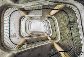 |
b) The rules of photography that I see in the photo are lines as the lines all lead you to the bottom of the photo or the ground.
c) Christian Richter took the photo. He is an art architecture photographer from JeBnitz, Germany.
2 Great Portraits
http://blog.phowd.com/2014/09/7-tips-shooting-great-portrait-photographs/
On the website I looked at different tips of shooting a great portrait. Many of these tips are fairly simple and show how to make the model more comfortable and look more natural.
a) On the website I saw different tips of how to create a more interesting portrait. many of the tips are fairly simple and just require out of the box thinking.
b) I learned that most of the best tips of getting the best portrait possible, are simple things such as breaking the ice with the model, take them out of their comfort zone, and have poses in mind before the shoot.
c) The site related to photography because it showed different ways to take a portrait.
3 Style
http://petapixel.com/2014/08/25/approaching-problem-style/
On the website, I learned about the different ways to have style in photography. Many parts of having style is taking out of the ordinary photos.
I learned that even very successful photographers don't have as much style due to them getting comfortable with the basics. In order to get style the photos must be different and unique.
a) On the website I saw different ways to create style in photographs. Many of the tips were fairly similar to the Great Portraits tips in needing to have unique photos.
b) I learned that to have style, you need to escape the basics and push yourself. Also, it helps if you know different elements that you would like your photo to accomplish.
c) The site related to photography because it deals with how to create better photos with more style by pushing the boundaries of photography.
4 The oldest things in the world
http://www.rachelsussman.com/oltw/
On the website I looked at some of the oldest land forms from around the world. Many of these have been around for thousands of years.
I learned that although these are some of the oldest land forms in the world, they are also some of the most beautiful and create very interesting images.
a) I chose this photo because I love the colors of this photo and how it all works together to create a very stunning image.
b) The rules of photography used are mergers and rule of thirds.
c) Rachel Sussman took this photo which was taken in Antartica.
5 Killer Timelapse
http://blog.ted.com/2014/10/07/how-to-create-a-killer-timelapse-with-joe-capra/
On the website I looked at Joe Capra and his time lapses. He takes time lapses of different areas all over the world.
I learned that there are other types of photography, such as time lapses that are able to capture all the changes over a period of time. These time lapses are pretty cool because it can show so much more than what a photo could.
a) In the video, I saw all of the changes that happen to Rio every day for a period of time.
b) Joe Capra made the video who takes time lapses all over the world.
c) Joe Capra worked a day job until he was inspired to try a time lapse. His time lapse was very successful and he was hired to do more so now he takes time lapses all over the world.
d) I learned that time lapses are another cool way of photography that actually shows the changes to an environment where a photo can not.
On the website I looked at different tips of shooting a great portrait. Many of these tips are fairly simple and show how to make the model more comfortable and look more natural.
I learned that taking the model out of their comfort zone can create an amazing photo. Also, just by shifting the focus of the model can change the whole mood of the photo and make it quite amazing. 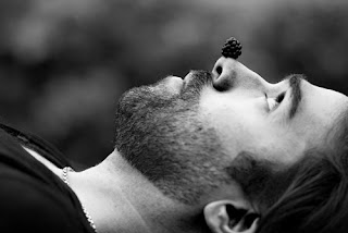

a) On the website I saw different tips of how to create a more interesting portrait. many of the tips are fairly simple and just require out of the box thinking.
b) I learned that most of the best tips of getting the best portrait possible, are simple things such as breaking the ice with the model, take them out of their comfort zone, and have poses in mind before the shoot.
c) The site related to photography because it showed different ways to take a portrait.
3 Style
http://petapixel.com/2014/08/25/approaching-problem-style/
On the website, I learned about the different ways to have style in photography. Many parts of having style is taking out of the ordinary photos.
I learned that even very successful photographers don't have as much style due to them getting comfortable with the basics. In order to get style the photos must be different and unique.
a) On the website I saw different ways to create style in photographs. Many of the tips were fairly similar to the Great Portraits tips in needing to have unique photos.
b) I learned that to have style, you need to escape the basics and push yourself. Also, it helps if you know different elements that you would like your photo to accomplish.
c) The site related to photography because it deals with how to create better photos with more style by pushing the boundaries of photography.
4 The oldest things in the world
http://www.rachelsussman.com/oltw/
I learned that although these are some of the oldest land forms in the world, they are also some of the most beautiful and create very interesting images.
b) The rules of photography used are mergers and rule of thirds.
c) Rachel Sussman took this photo which was taken in Antartica.
5 Killer Timelapse
http://blog.ted.com/2014/10/07/how-to-create-a-killer-timelapse-with-joe-capra/
On the website I looked at Joe Capra and his time lapses. He takes time lapses of different areas all over the world.
I learned that there are other types of photography, such as time lapses that are able to capture all the changes over a period of time. These time lapses are pretty cool because it can show so much more than what a photo could.
a) In the video, I saw all of the changes that happen to Rio every day for a period of time.
b) Joe Capra made the video who takes time lapses all over the world.
c) Joe Capra worked a day job until he was inspired to try a time lapse. His time lapse was very successful and he was hired to do more so now he takes time lapses all over the world.
d) I learned that time lapses are another cool way of photography that actually shows the changes to an environment where a photo can not.
 |
Wednesday, November 16, 2016
Local Austin Photographers
The photographer I selected was Matt Crump because when i was searching for an image his were the first I saw not only because I really liked the style he photographs in, but also because the pictures were so bright and full of color. He displays images of his travels and he takes them in a way where they feel almost too beautiful to be real. He creates a fun environment in his pictures, and its clear when looking at it. I was drawn to his pop of color and continue to enjoy his projects.

I love the way this image is set to the side and not in the exact center because it feels unique.
This picture displays Texas as a modern pop colored place.

I think this is my absolute favorite picture of his because i've looked at this tower a million times, but not once did i think of it in this popart colorful, fun way.

I choose this picture mostly because of the name which was "mini moo" which i found very funny and cute and creative which describes his photos well.

I really enjoy this picture becuase it has a nice and appealing feel. It gives off nice vibes and its so pretty.

This is just an example of the many quirky signs he takes pictures of. They always seem colorful and retro and i think he looks for signs like these to photgraph.

I love the way this image is set to the side and not in the exact center because it feels unique.
This picture displays Texas as a modern pop colored place.

I think this is my absolute favorite picture of his because i've looked at this tower a million times, but not once did i think of it in this popart colorful, fun way.

I choose this picture mostly because of the name which was "mini moo" which i found very funny and cute and creative which describes his photos well.

I really enjoy this picture becuase it has a nice and appealing feel. It gives off nice vibes and its so pretty.

This is just an example of the many quirky signs he takes pictures of. They always seem colorful and retro and i think he looks for signs like these to photgraph.
Monday, November 14, 2016
Mural Project
ART

BOOK

CANDY

CLOTHING

PLANTS

FURNITURE

DESCRIPTION:
Our group has decided to do a mural surrounding color. We have assigned each other specific colors to gather pictures of. I'm responsible for the color green and was told to take pictures of green things from the categories, Art, Book, Candy, Clothing, Furniture, and Plants/Flowers. Once we have all the pictures from everyone else in the group together, we will place the pictures from the same categories in columns.

BOOK

CANDY

CLOTHING

PLANTS

FURNITURE

DESCRIPTION:
Our group has decided to do a mural surrounding color. We have assigned each other specific colors to gather pictures of. I'm responsible for the color green and was told to take pictures of green things from the categories, Art, Book, Candy, Clothing, Furniture, and Plants/Flowers. Once we have all the pictures from everyone else in the group together, we will place the pictures from the same categories in columns.
Wednesday, November 9, 2016
Magazine Preview Assignment pt.4
Illustration based covers were the beginning of magazine publishing from the mid 1930s to the 20th century. A popular example of modern magazines is The New Yorker. There aren't many illustration cover magazines, but those that do have an illustration cover mostly presenting something funny or unusual. Most of the illustration covers are independently published that don't rely on newsstand sales.
Type based covers aren't seen as often, but can be seen in illustration based magazines. Type based covers are usually shocking. These magazines aim to make an impact on the readers. Sometimes, typing sometimes presents the message better than photography.
Image based covers are the most common types of cover designs. Image Based covers usually consist of people smiling while posing at the camera. A lot of the time the people on the cover are celebrities. Some magazines try to present the cover or person on the cover in an unusual or different way so the reader remebers it.
Concept based covers can be a mix of image, illustration, and type covers. They are mainly used to present a strong message that the author wants to get through to the readers. Concept magazines have to be instantly understandable to the reader. These magazines are also not seen often, but they do make an appearance in business magazines. One of the most well known concept based magazines today is the British Magazine Stylist.
The relationship between words and photos on a magazine covers is that they help each other to show the message. Photos can help text to show the message and text can help photos if they are not clear.
This is important because the reader can understand the message better with words and photos together.
Magazine Preview assignment pt.1,2,3
#1 Magazine Tips
1. Make the cover stand out amongst others
2. Create curiosity with your cover by using unusual elements.
3. Interesting content included
4. Familiar recognition
5. Worth time and money
#2 Best Magazine Covers 2013
1. Formal
2. Environmental
3. Formal
4. Formal
5. Formal
6. Formal
7. Formal
8. Formal
9. Formal
10. Formal
11. Formal
12. Formal
13. Formal
14. Formal
15. Formal
16. Formal
17. Informal
#3 My Favorite Cover

"For W’s December/January Art Issue, the magazine collaborated with artist Yayoi Kusama to create this iconic cover image depicting George Clooney. The visually arresting image is the highlight of the cover story, for which five leading female artists were invited to create interpretive portraits of the actor. Clooney wears a suit painted by Kusama with her signature polka dots and stands against a polka-dotted backdrop. Planned to coincide with the opening of an exhibition of new work by Kusama at David Zwirner Gallery, the cover makes a powerful reference to the artist’s iconic self-portraits."
My Critique: This photo is effective because the man, George Clooney, is shown in front of the busy background of black and white polka dots. He also seems to blend in with it with his own black and white polka dotted suit. This magazine is about art and style because of the title at the bottom and the picture displays the contents inside with the colorful display. This article could possibly be about fashion, expression, or color. The photo has good lighting and exposure. The photo was most likely taken from mid-distance because the suit and the background are both in focus. There is a subtle shadow behind George Clooney perhaps to show definition and value.
Wednesday, November 2, 2016
American Soldier
A) The most powerful image printed in The Denver Post from the year of coverage in my opinion is the one where Ian sits alone with his head down while his peers sit together in the back. This shows importance and depth because it shows immense detail regarding not only the situation he is in, but also his mood about the situation.
B) The text and the images are placed in a way where they relate to each other to help better tell the story and visualize it too.
C) The captions give the background information you can't get by just looking at the picture. It provides depth to the story and makes the viewer see the image differently.
D) Ian Fisher is a hardworking 17 year old boy who jumped at the opprutunity to support his country. He enlisted into the army and left his friends and family behind to start his new life. He soon realized military life did not met his previous expectations. Over the course of two years he indured the struggles of the army and himself.
E) The verbs are written in present tense perhaps to relive the moment for the reader.
F) On average each caption is around four sentences long.
The captions provide background information.
The third sentence gives information like 'later that day'.
Yes, some captions include a quote to add even more information.
Yes, some captions have four sentences usually if there is a lot happening in the photo or if someone is being described.
G) I think its possible to tell a whole story with only captions and photos because the images provide detail while the captions provide information.
H) Usually stories provide things like emotion and description of surroundings. Reading a story can be more enjoyable for those looking for that kind of depth.
Monday, October 31, 2016
Self Portrait and Portraits Part 1
Rules:
A. Looking off camera – Have your subject focus their attention on something unseen and outside the field of view of your camera. This can create a feeling of candidness and also create a little intrigue and interest as the viewer of the shot wonders what they are looking at. This intrigue is particularly drawn about when the subject is showing some kind of emotion (ie ‘what’s making them laugh?’ or ‘what is making them look surprised?’). Just be aware that when you have a subject looking out of frame that you can also draw the eye of the viewer of the shot to the edge of the image also – taking them away from the point of interest in your shot – the subject.
B. Experiment with Lighting- Another element of randomness that you can introduce to your portraits is the way that you light them. There are almost unlimited possibilities when it comes to using light in portraits.
Side-lighting can create mood, backlighting and silhouetting your subject to hide their features can be powerful.
Environmental Portrait-
I liked these because they're real and show a feeling as well as an atmosphere.
Photography Portraits-
I liked these two portraits because of the dramatic environment it expresses.
Casual Portrait-
I liked these two portraits because they feel normal.
Wednesday, October 26, 2016
Funny Captions

1. December 22, 2007 Ms. Winkle gives everyone a message at Whole Foods to have them better understand her hatred for them.
2. Ms. Winkle purchased this shirt on her son's birthday to celebrate.

1. September 3, 2009 Ms. Myra calmly sits under a sign to express her alter ego while waiting for the bus.
2. Ms.Myra is often seen as small and old, but she longs for the day people better understand her so she planned on sitting under the sign.

1.October 12, 2014 at midnight, Elliot Minkles was sitting in his house excited to light his 100 candles for his 100th birthday but is disappointed when the cake went up in flames.
2. Elliot Minkles bought cake decorating supplies with a purchase of 26 packs of candles before he placed each one on his cake.
Friday, October 21, 2016
Rules of Photography II
Subscribe to:
Comments (Atom)


